When I began working in CX Events, social media wasn’t yet a focal point for the organization. My first step was to conduct a thorough diagnosis to understand the company’s mission, values, and communication goals. From there, I developed a strategic communication framework, which included creating a brief, defining the brand’s voice and tone, developing an empathy map, setting clear objectives, identifying our target audience, and detailing the brand guidelines.
With this foundation in place, I focused on planning and creating content for social media, closely monitoring paid campaigns and key metrics to identify areas for improvement.
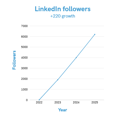
Over the course of two years, I successfully increased our followers by 220%, a remarkable achievement considering the niche nature of our community.
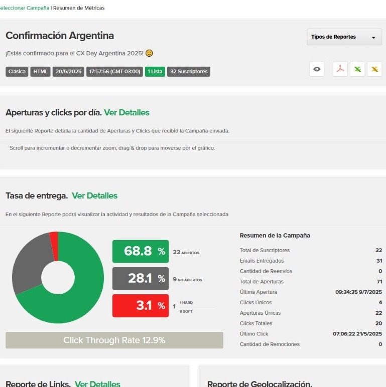
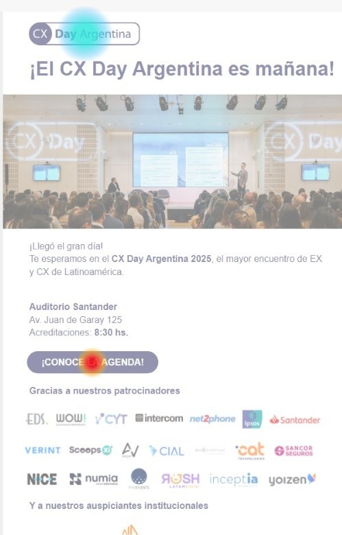
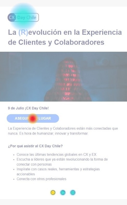
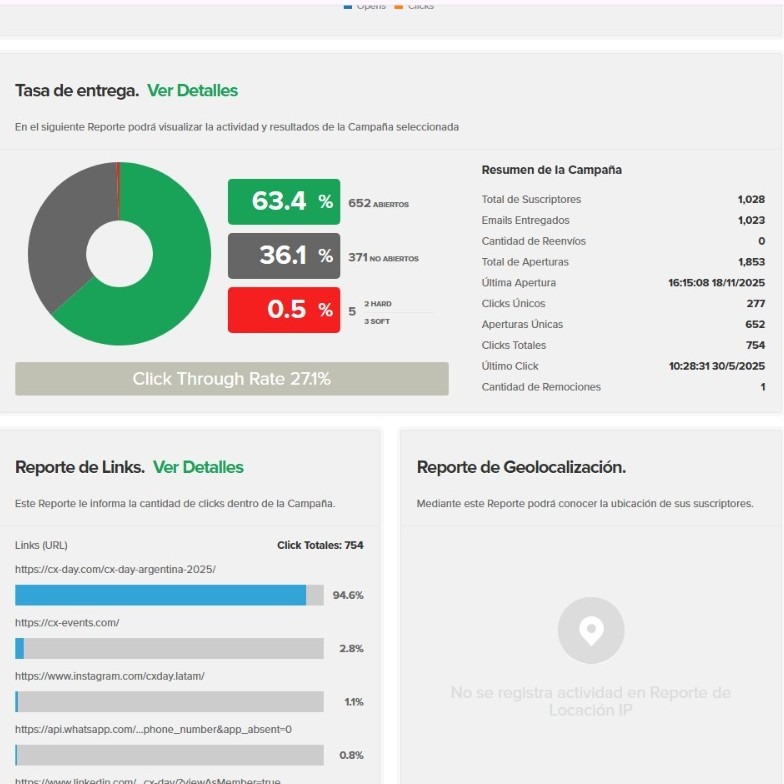
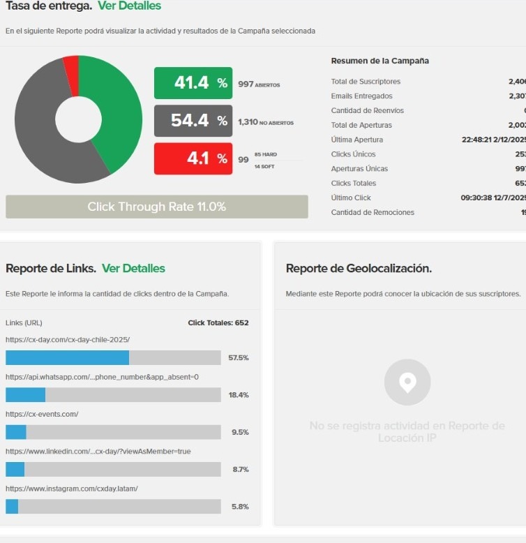
Here’s a snapshot of one of the many email campaigns I crafted as part of the CX Day 2025 communication strategy.
Although we had a loyal CX/EX community, we needed to grow the database, increase registrations, and keep users informed across several touchpoints.
We had three main goals:
Attract new attendees and encourage registrations
Guide them smoothly through every step before the event
Maintain the connection once the event was over
Our audience included CX and EX professionals, decision-makers, leaders, and experience managers across Latin America.
While I collaborated with a small team — a designer and a closer — I owned the UX writing, design direction, segmentation strategy, and A/B testing.
We started the year using Mailchimp, but eventually switched to Doppler because it gave us more control and a better experience for our workflow.
Across three months, we built a 10-email sequence that moved through three stages:
1. Acquisition: Announcing the event, highlighting value, and driving registrations.
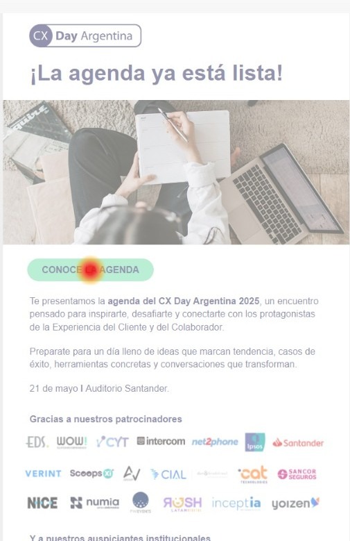
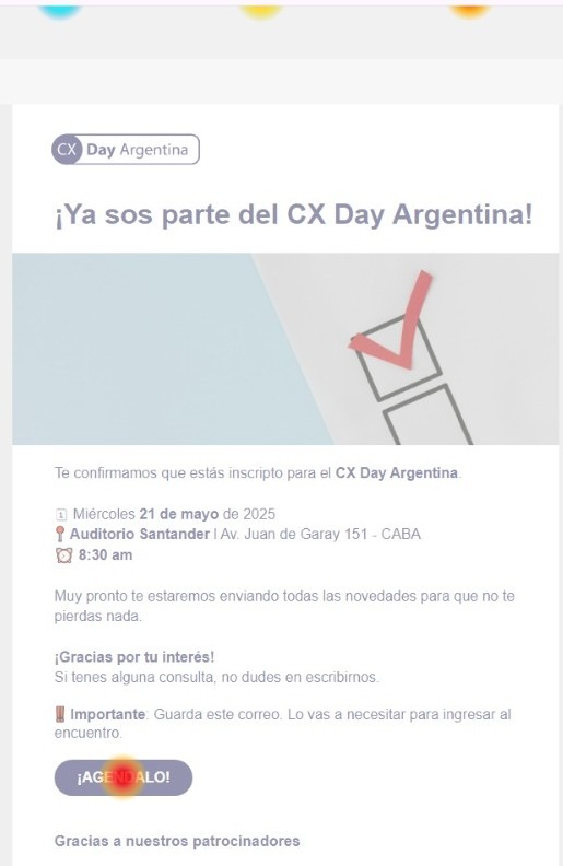
2. Pre-Event: Confirming attendance, sharing agenda details, spotlighting speakers and sponsors, and preparing people for the day.
3. Post-Event: Thank-you messages, photos, recap videos, and feedback surveys.
What made this year special was the way we worked:
1. For the first time, we incorporated A/B testing across subject lines and CTA placement.
2. We broadened and cleaned the segmentation, increasing relevance.
3. We refined our message hierarchy and tone based on real user behavior.
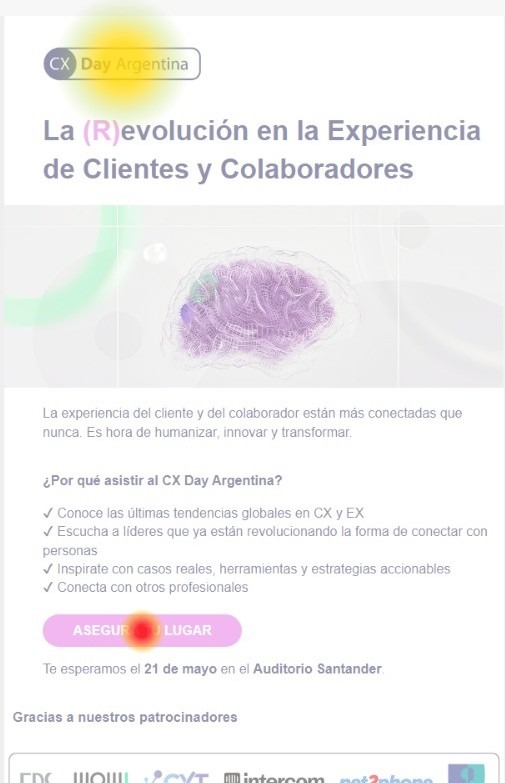
4. We built each email using a brand-consistent, UX-driven layout co-created with the designer.
Working with the designer, I directed the structure and flow of every email:
Clear visual hierarchy
Scannable blocks
A single primary CTA
Light, modern color palette aligned with branding
Images placed intentionally to guide attention
Short, human-centered microcopy
Even in a fast-paced context — with last-minute changes and many stakeholders — we maintained coherence, clarity, and consistency across all campaigns.
One of the most rewarding outcomes was seeing the numbers reflect the work behind the scenes.
We initially projected 600 registrations.
We closed the campaign with more than 1,200 registrations and in-person attendees.
Some KPIs that stood out:
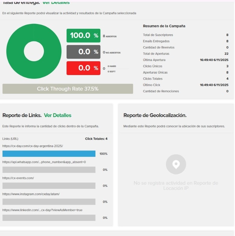
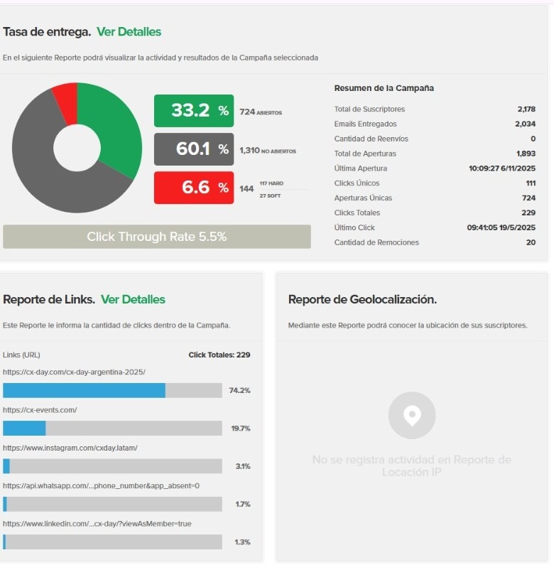
Open rates up to 68.8%
CTR up to 12.9%
Engagement steadily rising across the three stages